top of page
Branding
Always On Agency
Brand Identity
Client / Always On Agency,
Year / 2017
提升公司的品牌形象與專業感。
会社のブランドイメージをアップするためです。
The goal is set to improve the company’s professional image.
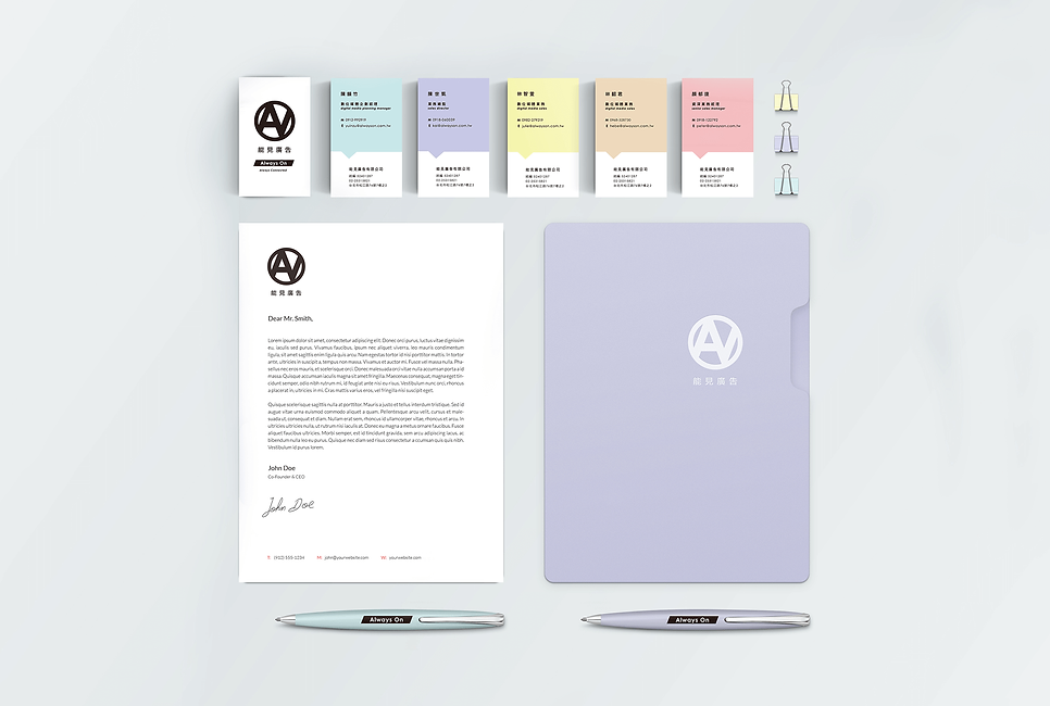
依客戶期望以公司名稱字母為Logo設計主體,呈現簡潔而有力的標章設計。在名片與相關用品設計上導入多樣化的色彩,讓各個職員展現獨特性的同時,也代表了公司充滿不同的活力。
お客様の希望の通りに、会社の名称を使て、シンプルで力があるロゴに仕上げました。名刺のデザインについて、それぞれの色を使うことで、各職員の独特な個性が表せられる同時に、会社にある様々なる元気さも表します。
Characters of the company logo are the main design body to create a neat and powerful symbol design as the customer’s wish. Diverse colors are applied in business card design, allowing the employees to show their own unique features and the energy that fill the company.


bottom of page