Website
Linkai Investment
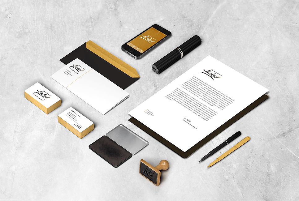
Team Identity
Client / Linkai Ivestment Team
Year / 2018
塑造品牌的個性與形象,提升信賴感。
ブランドの個性と信頼感を具象化にする。
The goal is to mold the characters and the image of a trustworthy brand.
將團隊名稱以簽名般的文字設計表達簽章、認證的信賴感,字尾的箭頭設計代表投資、獲利的上升曲線,整體設計呈現尖銳與俐落的感覺,象徵公司投資的精準與敏銳,並以燙金的設計點出金融業相關特性,同時呈現品牌的精緻感。
向うは投資グループので、チーム名を信頼感がある手書きサインの表現を決めました。利益上げることを表すために、筆末には上向きの矢印を使いました。全体的にも、鋭敏で、洗練された投資会社に相応しい感じに仕上げました。色にも金融業に相応しい金色を選びました。
The types of the team name are designed in a signature-like style to reinforce the sense of trust similar to stamps or acts of verification, and the arrow-like end of the stroke symbolize the ascending curve of return on investment. The overall design coordinates the sense of being sharp and neat, reflecting the company’s precise vision in investment. The golden color created by hot foil stamping not only refers to the financial industry but also embodies the chic corporation image.


